Now I got the images, I have to look at the finer details like text and paper. One thing I have already decided on is the font. I have used ‘Myriad Pro’. This is because I wanted something very simple. I will use a dark grey font so that it is not as dark as using a black font and keeps the image the main focus.
TITLE
The next thing I need to do is choose a title for this project. I always had it in my head that it would be just one word. As Covid-19 has affected people in so many different ways, one word to sum it up will work better. Also titles with one word can be more intriguing as the viewer might be more interested to understand the meaning.
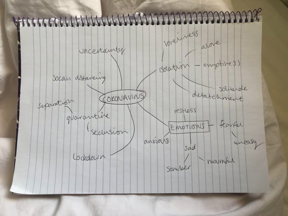
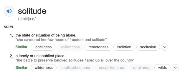
To find the right word to use I wrote down words that related to Coronavirus. These were mainly emotions or words we hear often. For me solitude stood out the most. From speaking to people in the last two months, the main theme of how people felt was isolated. Isolation has affected most people in the world! But as isolation is a word that we hear so often, I thought solitude would be more interesting for a title. When researching the meaning of the word solitude, it refers to both the feeling of being alone and also a lonely place, which for many people right now is their homes.
TEXT
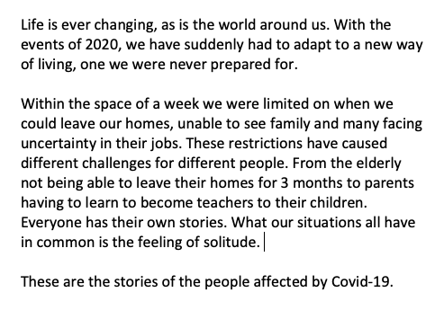
The next part which is important is my artist statement. My work could potentially be shown in the London degree show and so a strong bit of text to support my work is important. I will also put the text in with the portfolio prints for the viewer to understand the context. Below is my initial text, I have sent it to various people to see how it could be improved. Some things that I felt I should include was the year and the word Covid-19 so that there was no confusion in what the project is about. The year was important as if the work was viewed in a few years, the viewer would know when it happened. I wouldn’t normally think to include these specific details but we are living through history right now. I did wonder whether I should be writing it as ‘we’ or write as if I was in the future looking back on the event. But saying ‘we’ feels more inclusive and as the people viewing my work would have lived through Coronavirus, they can relate to the text.
PEOPLE’S COMMENTS
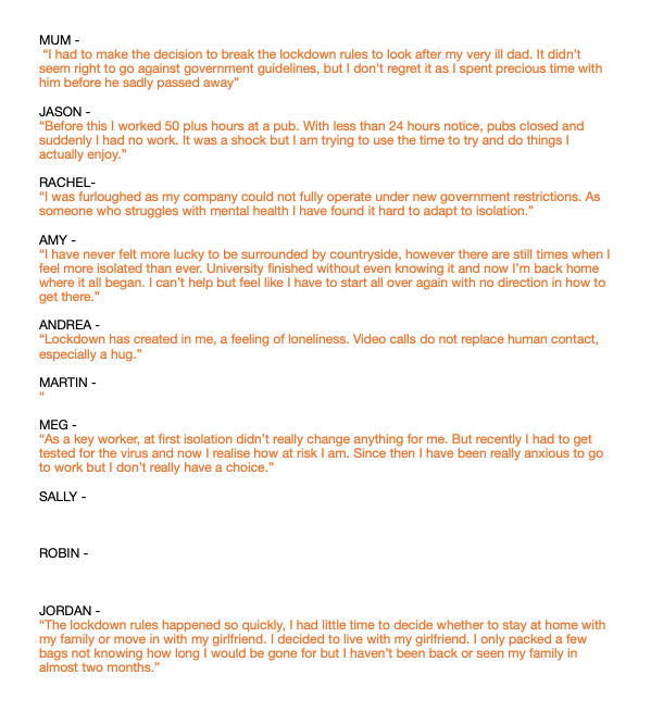
As I am including text about each person’s story, I have messaged each person and asked them to write a few lines about their lockdown experience. The responses I got were so interesting. When I was shooting the photos I had little idea how much these people were effective. What was also interesting is that how differently people were affected, some talked about work, whereas other talked about the uncertainty of university. Now I have most of the text from people, I can see how effective this will be alongside the portraits.
PAPER
The last thing to think about is how I will print it. With the 3 large prints I would print on a pearl paper, on the large format printer at university. I normally like to print on matte paper but the gloss would add to the reflection in the images. The glossy/shiny part of it will make it seem like a window. Previously for the Photocopy Club exhibition I printed on A0. I loved that having such a big print drew in the viewers attention and allowed to see finer detail in the image. This is the size I would like to print again, as I only have 3 finals to print this will be doable and fit the exhibition space well.
For the portfolio prints they will be 10×12. I have held sized prints I already had and this size was best to clearly see the image but also be able to handle easily. I ordered some paper samples to see what will fit best. I like the idea of a gloss paper to replicate the window affect but I alway want something that feels quite delicate to touch. I liked ‘House gloss 170gsm’, it was thinner than some of the other but then began to think it seemed to much like a magazine paper. Instead I think the better option is ‘House Silk 300gsm’. It is not as shiny as the thick glossy paper which makes it nicer to touch.
