BOOK
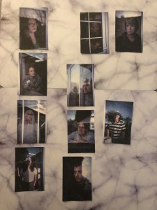
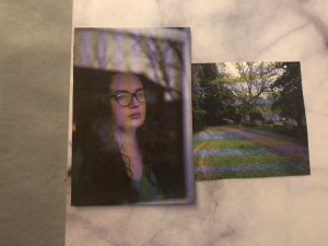
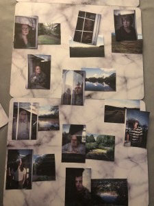
To easily look at the sequence of my book I have printed out all the images I am going to use. This makes it easier to see what photos work best together. Firstly I spit both the landscapes and portraits into categories. For the landscapes this included ones that had water in, ones that were open space and another which had more trees/darker. There was a lot of differences in the portraits but the most noticeable ones were the two different ways the people were facing, then there were two images that were darker than the rest.
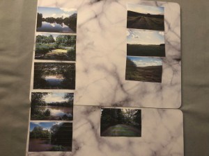
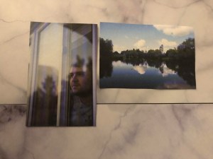
Next I paired photos together. To do this I looked at things that linked photos, for example in the first image there was a lot of sky and so I paired it with an image that had more sky in. The next one showed tree branches in the reflection and so it worked well with the landscape with lots of trees in.
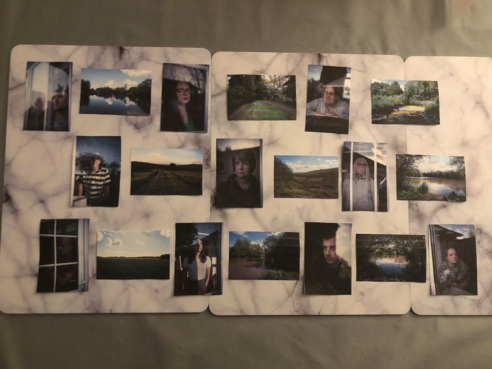
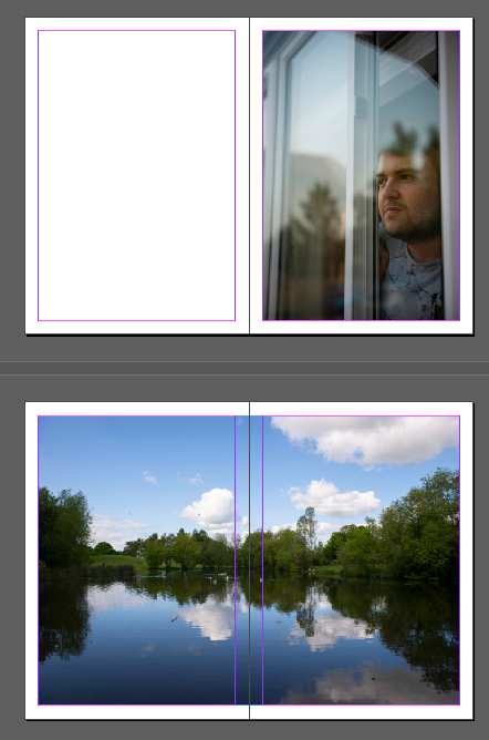
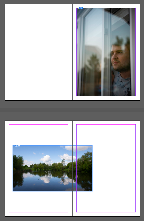
After I experimented with the order they will be displayed. I had one more portrait but I liked it at the end with the person looking to the right, almost like it is out of the book. Below is some layout ideas I have experimented with. The first is my initial idea, every other page is a double page spread of the landscape. Each photo has its own page to clearly see it. But from my research, the landscapes are too big in comparison.
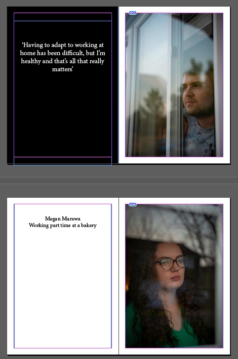
In the next design I have included text. By looking through other photo books, I realise the text can be so impactful. I think back to what Lisa Whiteman said about how photos can only begin to scratch the surface on the subjects story. Also in Alex Ingram’s work, what made me more engaged with the work was the captions that said about who the person was. I asked one of the people in my photos in about their experience of lockdown/Coronavirus and put that on the page next to their portrait. Or another idea was just include some simple facts about who they are and what they do. Like in Diane Arbus’ book. I experimented with the black background as this is something I had seen in another book and thought was interesting, it breaks up the pages a bit. The last design is including the landscape again but displaying it smaller instead of a whole double page.
PRINTS
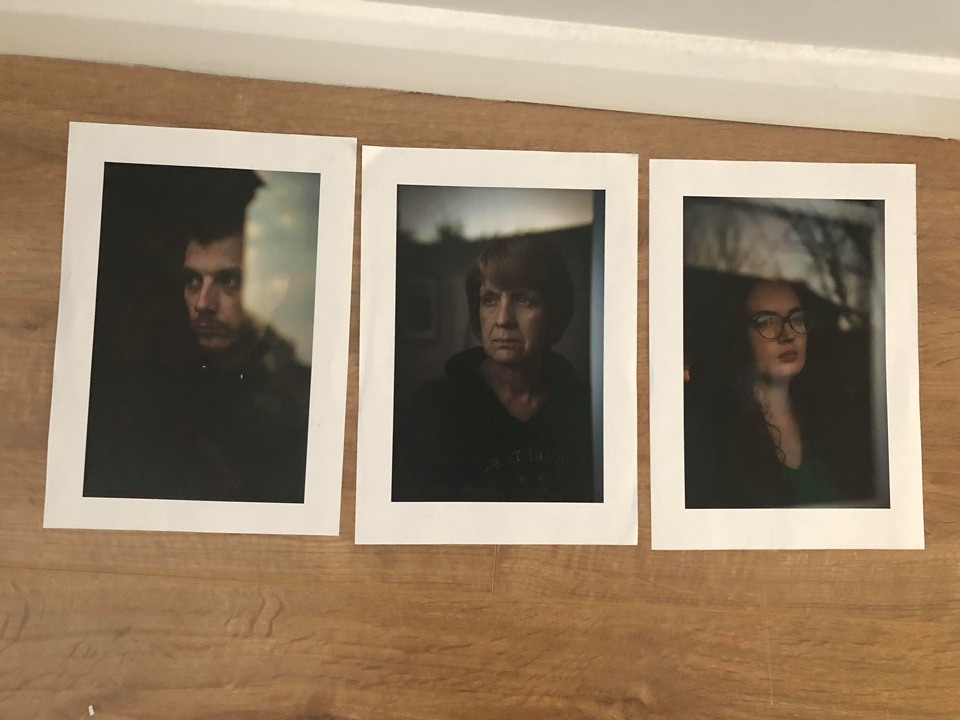
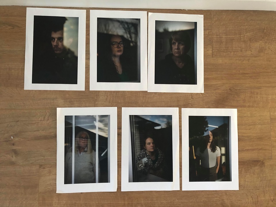
I am using all my photos in the book but I plan to use 3 or 5 as final prints. My aim has always been to have large prints to exhibit. They are good quality portraits and so they would be most effective printed large, almost as if you are looking at the person.
To decided which photos to use, I put the ones that were not as strong to the side. The main problem with them is that the subject expression is not quite as moody as I planned. I think they were trying hard not to smile and it shows. The other one I decided not to use was because there is no sky in it and this is what I find effective in the other ones.
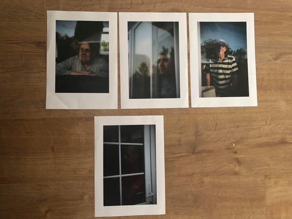
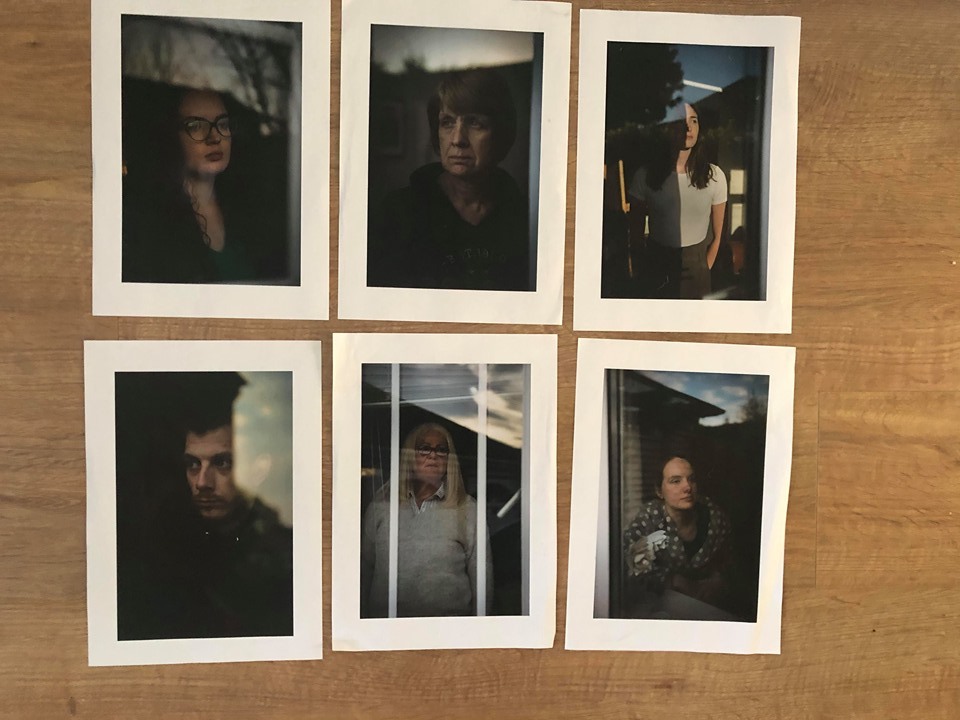
I now had 6 to choose from. I have decided that having 3 finals will be better as there is two sets from this group of 6. The first set has darker images and therefore more atmospheric. The second set is lighter with brighter skies and more colour. I am going to choose the darker ones as it fits with the message I am trying to portray.
Lastly I experimented with the order they will be displayed in. It was difficult as one of them was looking in the other direction. This order below was the best, the sky flows well throughout the images. The line from the silhouette of the houses is at a similar level and this also links the photos.