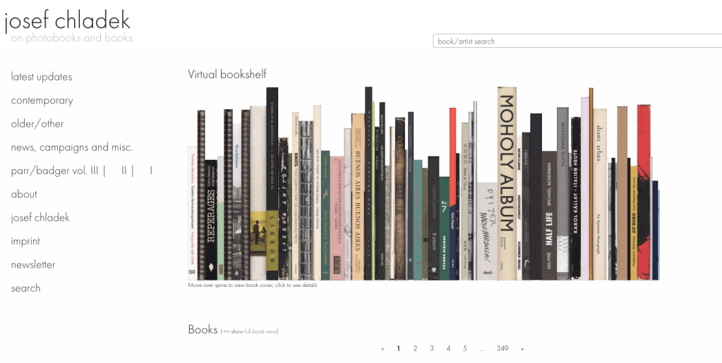
Before I finalise my book layout, I am going to look at other photo books and what works best in them. I looked on Josef Chladek’s photobook website. This site is really useful at browsing and viewing photo books.
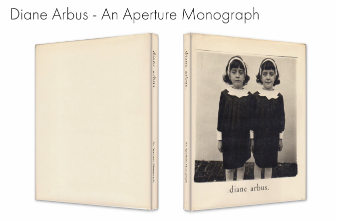
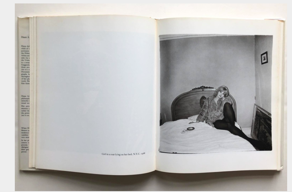
As my work is mainly portraits, I tried to look for more books on portraiture. The first one I saw was Diane Arbus’, An Aperture Monograph. Although it includes many different projects, I like how it is laid out. Each image has its own page and this means you can view it without any distraction. There is no other image on the opposite side to influence how you read the photo. On the left page it does have a small bit of text about what it is and when it was taken. I have started to think about including text and I do like this small detail in Arbus’ book which gives a bit of context.
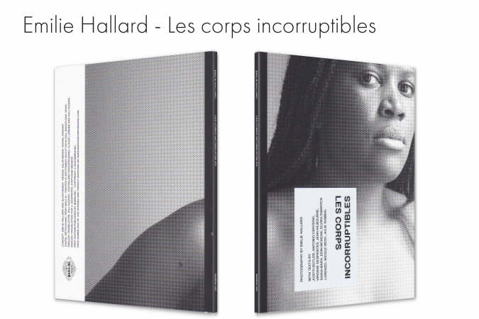
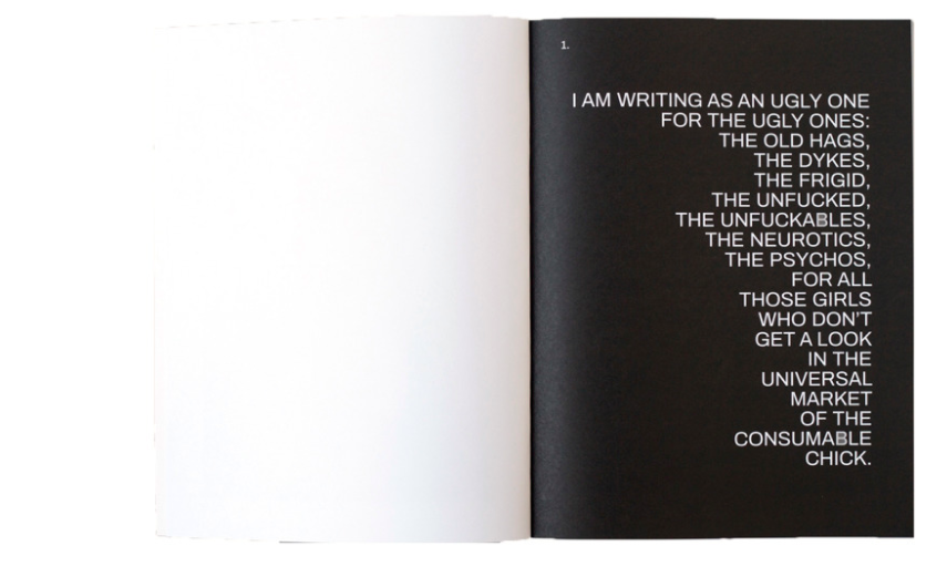
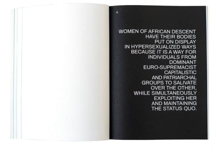
Another book I found interesting was Emilie Hallard’s, Les Corps Incorruptibles. It is a ‘celebration of the diverse, the unlikely, the ambiguous, the androgynous, the non- obvious and the non-binary’. Its starts with a powerful bit of text, that lets you understand what the book is about. Like the previous book, the portraits have their own page which is more impactful at emphasising with the subject. From what I can understand from Chladek’s website samples, there is other important bits of text throughout the book.

There is not much information about what this book is about but the layout seems similar to what I have planned. A portrait fills up half a double page spread, then on the next page is a smaller image of a sky, object or nature. This has made me think a lot about my work. My portraits are the most important part of the series and so it doesn’t make sense that my landscapes are displayed so much bigger. I could display the portraits a lot smaller to make sure the portraits are the main part.

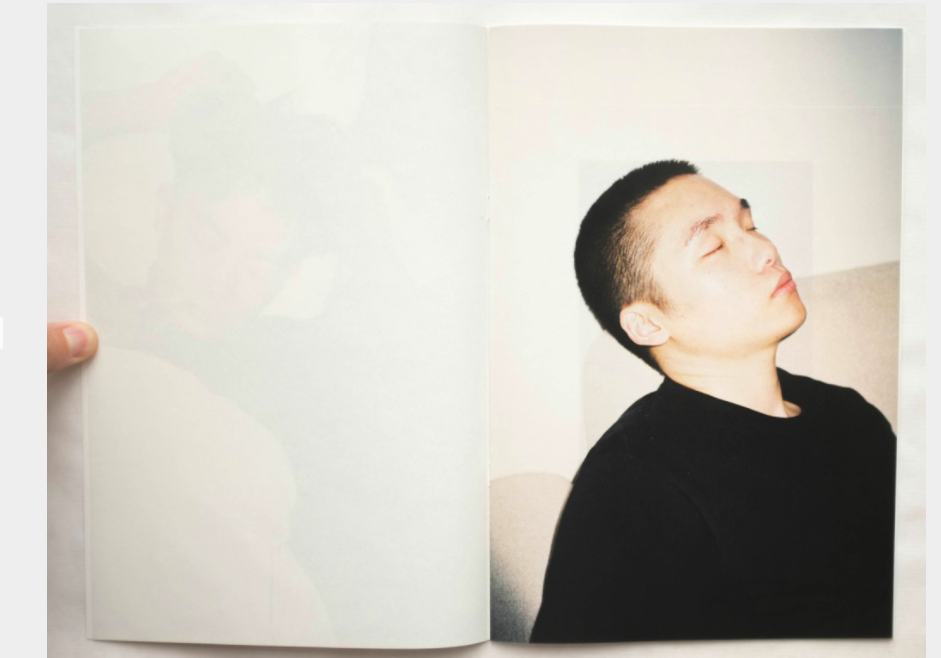
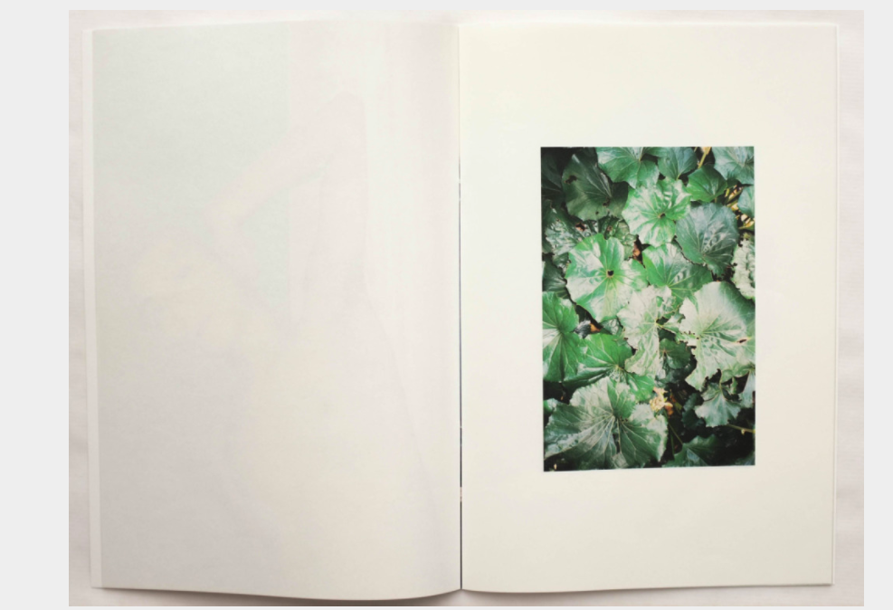
From this research I have definitely decided that I want only one photo on each page. For this project this will be more effective as each person has their own story and so it will work better displayed on their own. I also think showing my landscapes smaller will mean there is more emphasise on the portraits.
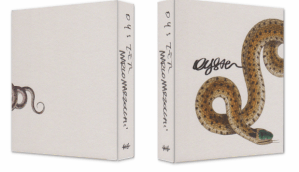
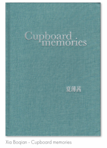
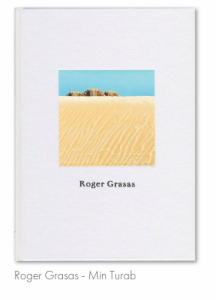
The website has also been helpful for deciding what to do for my cover. I scrolled through so many pages getting inspiration. I started to look at what made me want to click the book to see more about it. I know a lot of photo books have one of the images on the front, this is usually effective but for me I like it when the cover doesn’t give away much about the book but instead makes the viewer intrigued about what is inside.
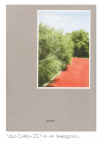
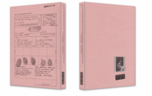
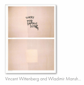
I like the more minimal covers. It makes me more interesting in what it is about. The bottom left is interesting as the book is about police report photography and the cover looks like some kind of crime report. The two that do include photographs, I like that they have made them quite small, instead of filling the whole cover.I now need to decide on my own cover. I plan to have a simple title and as my work is about isolation, I think it would work well to have just the title on the page. I will consider including an image to see how this changes it.