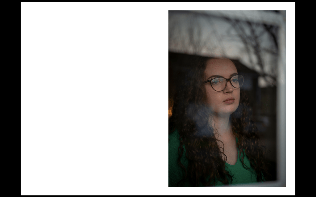
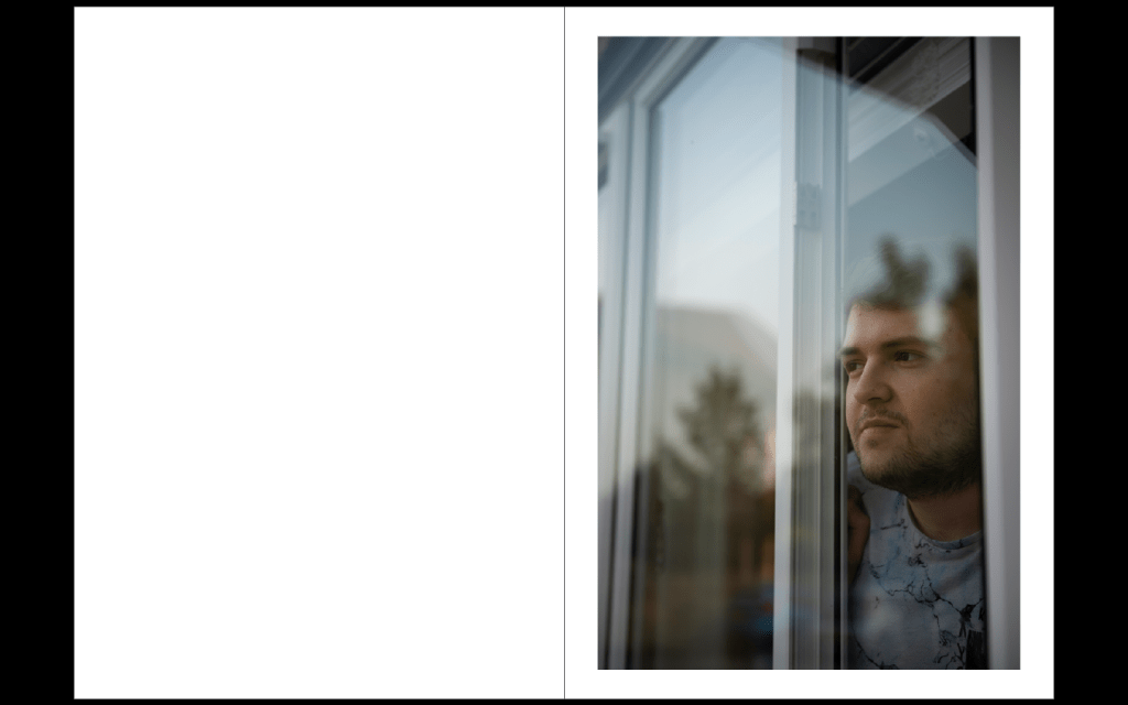
I now have 5 strong portraits and many more lined up. I also have some successful landscapes from my walks. Since I have had this book idea, I have always imagined that I would have the portrait on one page, followed by a double page landscape photo. This means each portrait is broken up between pages. Also the reflection in a lot of the windows shows trees and nature so it flows well into the the landscape image. It works well as showing the people longing for the outdoors. I put my images into InDesign to see how the different images work together and see a rough book layout design.
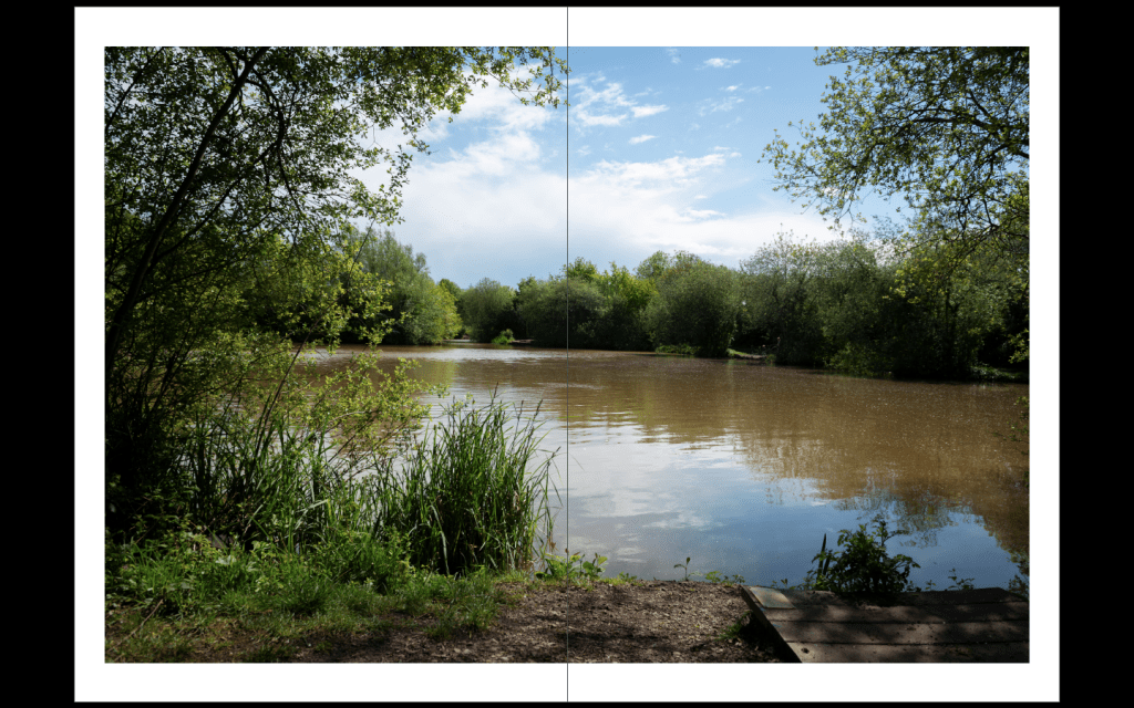
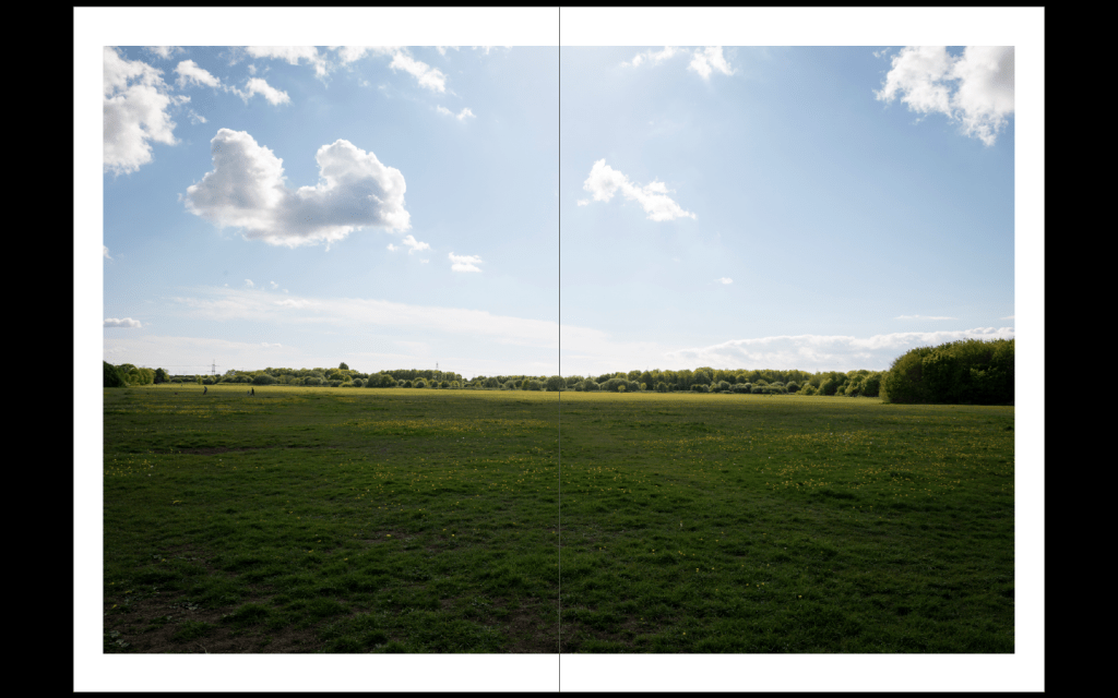
I am happy with how this looks. I think if I just displayed all the portraits it would be a bit repetitive. The landscapes in-between add more depth and will be more intriguing for the viewer. I might not put any text about why the landscapes are there so it would leave it to the viewer to make assumptions about the context. This is always interesting when viewing photography work.
The simply layout of portrait on one page followed by double page image works well as it allows each image to be fully appreciated. Only having one on each page means none of there is no distractions from each other.
I was worried that the landscapes looked a bit bright and sunny as I was trying to create more somber images. But I think making the landscapes look more pretty works better as it fits with my idea that this is what people are longing for.
