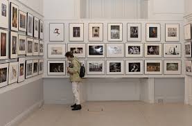
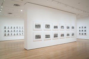
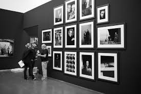
Although I can not exhibit my work, I am going to research and decide how I would display my work. I had already decided on my paper which I would print on, I would print on Pearl paper on the large format printer. I was not able to print larger since my tutorial where they recommended printing bigger. I would not want it much bigger, so I would probably print around 12×18 size.
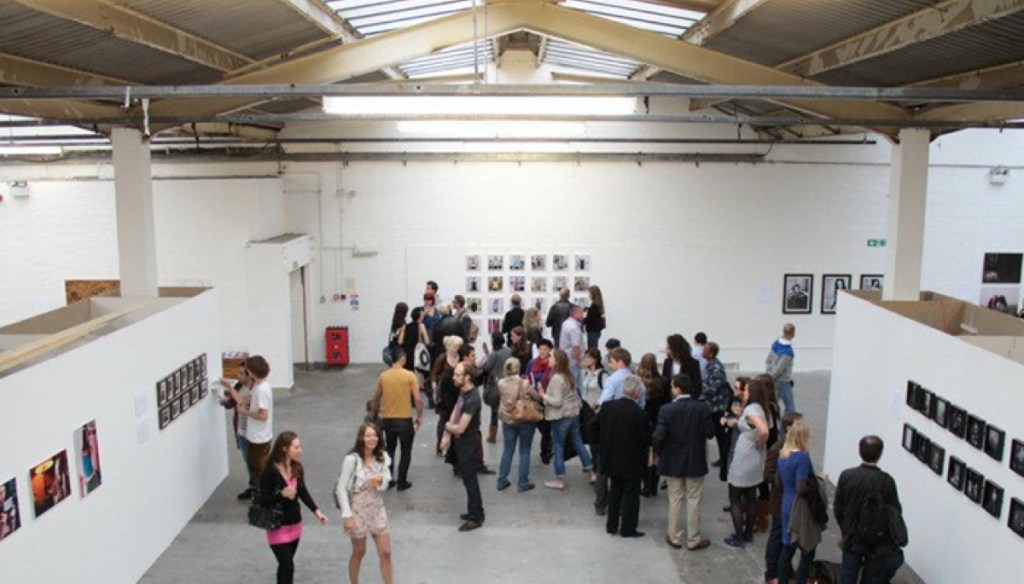
We were meant to be displaying our work in London, in the Free Range show. I have never been to it before so i searched pictures of it for inspiration. The only other time I have ever displayed my work in an exhibition was the Photocopy Club exhibition.
I planned to have quite a few final images to really compare the differences of each one. Initially I thought I would display them in a grid format, but looking at that first image above, I think it looks a bit much. The second image is an improvement as they are more spaced out and also look more minimal. The use of white frames means there’s not a black line round each photograph which added to it looking too much on the first image. The last image made me start thinking more about black and white. The photos look quite different but it works as they are all in black and white. I like the size of them as well, big enough to see each photo clearly.
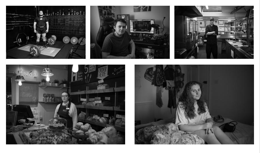
This is a quick layout I made, I tried the photos in black and white to see if it was effective. It does work as making the images fit together well, but it is not showing the images as their best. What I liked in most was the colours and tones. For example the one of Meg in the bakery, the warm tones made it atmospheric and the colours of the food made the image intriguing. In black and white, this is all lost.
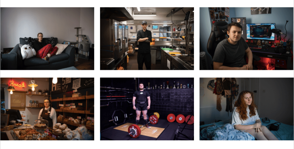
The first photo I added in to make an even number, I do not plan to use this one (hopefully I’ll get chance at some point to replace it will a better photo). I want my images to all be the same size and spaced out evenly. This shows that there is not one that is more significant to the others. When arranging them there was a lot to think about. Firstly the top left and bottom right images had plain backgrounds. I put them opposite sides to spread them out. The two images in the middle, they are both standing in the middle of the frame, facing straight to the camera. I thought these worked best in the middle as all the others are sat down of facing to the side. One thing I noticed and will now be aware of on future shoots is that the three sat down are all facing the same way. Although a small detail, I plan next time to get them to face the opposite way to mix it up a bit. Overall I like this kind of layout. I would display them in white frames, and enough apart that they don’t distract each other. I have had criticism in the past that they are all quite different and will look like theres too much going on when displayed together. Now I have seen them together, I like this contrast of lighting and colours. I think the viewer will be interested in all the differences. My aim for this project was never to take photos that all look the same.
